
Models of reducing carbon emissions – and negative emissions?
Models of reducing carbon emissions
My previous post discussed a recent report from Oxford Economics,which discussed the replacement of workers by robots. It predicted that on average 1.6 workers will lose their jobs for every industrial robot installed.
However, the introduction of robots will generate economic growth and create jobs:
Our study shows that the current wave of robotization tends to boost productivity and economic growth, generating new employment opportunities at a rate comparable to the pace of job destruction.
My post criticised Oxford Economics because their report ignored climate change: To keep to climate targets steep falls in carbon emissions are necessary. This is very unlikely to be possible with continued economic growth.
Introduction
Recently a graph in a tweet by Greta Thunberg caught my attention
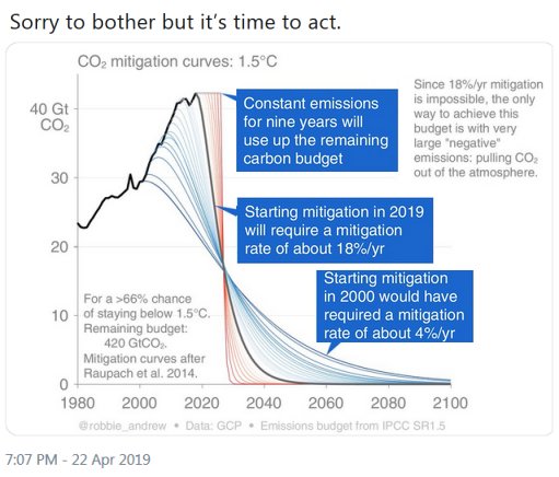
Figure 1
The argument embedded in this image is not difficult: Carbon emissions must be reduced to limit global temperature rise to 1.5 °C but the necessary rates of reduction are so great as to be impossible. It is therefore necessary to extract CO2 from the atmosphere – as the author of the original image, Robbie Andrew, said:
Since 18%/yr mitigation is impossible, the only way to achieve this budget is with very large “negative” emissions, pulling CO2 out of the atmosphere.
The “budget” is the remaining amount of CO2 that can be emitted before a rise of 1.5°C in global mean temperature becomes inevitable. In this context, mitigation means reduction. This can be restated as:
With very large negative emissions, it will be possible to avoid impossible rates of reduction of carbon emissions.
It is then a short step to say:
Negative emissions mean it will be possible to avoid uncomfortable rates of reduction of carbon emissions.
This version is more relaxed about carbon emissions:Why have uncomfortable reductions as negative emissions will be there to rescue us?
“Good news” on negative emissions
The importance of negative emissions has prompted some “good news” stories about them. One recent story suggest trees can be planted to suck up hundreds of billions of tonnes of CO2:
Planting billions of acres of trees in an area the size of the US could be the “most effective climate change to date”, researchers say.
A study found there is the potential for an extra 900 million hectares (2.2 billion acres) of tree cover in areas that would naturally support woodland and forests.
But others disagree:
Professor Simon Lewis, from University College London, said the estimate that the extra forests could store 200 billion tonnes of carbon was “too high”.
He added: “New forests can play a role in mopping up some residual carbon emissions, but the only way to stabilise the climate is for greenhouse gas emissions to reach net zero, which means dramatic cuts in emissions from fossil fuels and deforestation.”
There are many other schemes for removing CO2 from the atmosphere: seeding the sea with iron salts, grinding olivine rock and spreading it on mud flats, sinking bales of wheat straw in the deep ocean (& etc.) but will it be ‘alright on the night’. Many experts think not.
The dangers of relying on negative emissions technologies were discussed by Hugh Hunt and Kevin Anderson in A Rule Book for the Climate Casino.
Robbie Andrew exaggerates ‘impossibility’
Robbie Andrew says reducing emissions by 18%/year is impossible. Is he exaggerating?
Military action could cut carbon emissions much faster than 18% a year. Imagine that the military powers of the US, China and Russia agreed to stop 90% of the world’s use of fossil fuels and shut down pipelines, oil tankers even fossil fuel power stations. I’m no military expert but – if these powers agreed – they could do it.
An exponential decay is one where there is a fall by a fixed percentage every year. Andrew’s model uses a more-or-less exponential decay, falling by about 20% a year. However, the postscript will point out that most of these reductions are not significant because they are 20% of almost nothing. In Andrew’s data by 2085, the yearly emissions are less than a millionth of the initial values.
A linear decay
Alongside Robbie Andrew’s model the postscript examines a linear decay. The rate of decay is chosen so that total emissions are about the same as those in Andrew’s model. This should keep the rise in global mean temperature to within 1.5C.
The linear model describes CO2 emissions falling by a fixed amount of 2.64 Gt per year from an initial value of 42.23 Gt CO2 in 2019. They reach zero in 16 years. The decay for the first year is 6.25% – in the last year the fall is 100% – from 2.64 tonnes CO2 to zero.
Both models are unrealistic – and depend on choices that humans have yet to make – but the linear model puts less emphasis on negative emissions – sometime in the future – and more on cutting emissions now.
Postscript: Details
Andrew’s model
The original of the graph in in Greta’s tweet is in Robbie Andrew’s It’s getting harder and harder to limit ourselves to 2°C. He shows graphs that model falls in CO2 emissions necessary to keep within specific global temperature rises. These graphs are the mitigation curves from an earlier paper, Raupach et al. 2014. These look like more sophisticated descriptions than the linear and exponential decays.
The curves in Robbie Andrew’s paper have large sections that look nearly linear. Linear falls have variable rates of decay. The rate of decline in the diagram is labelled as 18% a year. If there are sections which are linear, what does it mean to say the rate of decline of these linear sections is 18%? They should be varying.
The data for Figure 1 can be downloaded and the year by year rates of decay can be calculated. Fig 2 gives a graph showing these for the curve starting in year 2019. The decay rates quickly build up to around 20% a year and stay more-or-less steady until wobbles in the last few years, when emissions are close to zero.
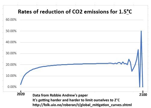
Fig 2.
This curve suggests that the decay of emissions is approximately exponential because, after a few years of start-up, the rate of reduction are fairly steady – if the variability at the end is ignored. The graph of the CO2 emissions themselves (Fig 3) does indeed have a shape that looks roughly exponential from about 2025. It was a mistake to think there is a linear section in the middle years.
Shortly after the start most of the curve is roughly exponential with a decay rate close to 20%:
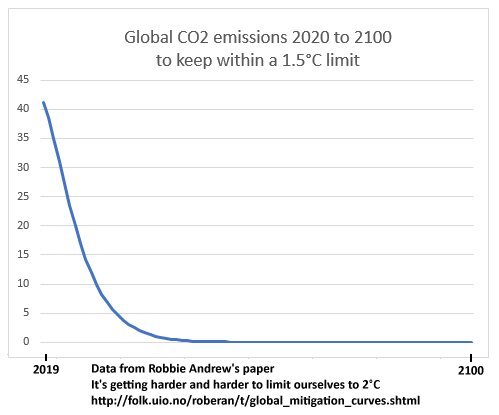
Fig 3.
On closer inspection this curve can be seen in the original 1.5C diagram. (Fig 1) This variability in rates of reduction at the end is caused by rounding errors because the emissions in the latter years are so small. See Table 1.
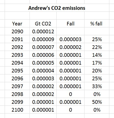
Table 1
Nothing surprising here: An exponential decay over 8 decades at 20% a year would fall to a tiny fraction of the original value. The ending wobbles are because the data ran out of numerical accuracy. However, is a clue.
In Andrew’s data by 2085 emissions are roughly a millionth of emissions in 2019.. Cutting emissions by 20% of these values is not a cause for worry: This reduction could be captured by planting a small forest.
Robbie Andrew’s data shows total emissions of 357 Gt CO2. That fits within the remaining carbon budget for a 1.5C global temperature rise with a 67% chance of success, according to the IPCC special report on 1.5C.
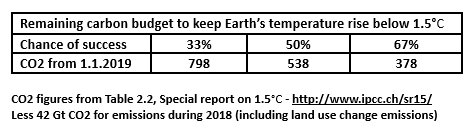
Table 2
A linear model
What is the effect of Robbie Andrew’s choice of curve for falling emissions? Would other curves give different results?
An alternative model could have emissions fall at a linear rate – by an equal amount each year rather than a fixed percentage. Simple experimentation with a spread sheet gives a linear trajectory for emissions falling to zero in 16 years, giving roughly the same total CO2 emissions as Andrew’s curve:
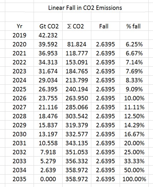
Table 3
Table 3 shows a decline of emissions by 2.64 Gt CO2 each year from the initial value of 42.2 GT CO2. This achieves zero emissions in 16 years. Compare this with the first 16 years of Andrew’s model:
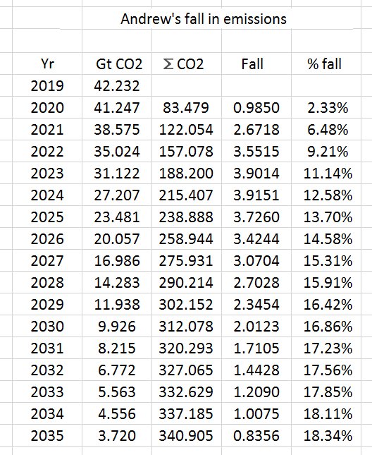
Table 4
Table 3 shows that after three years of start-up the percentage falls in Andrew’s model are much higher than than those in the linear model. In the latter years of the linear model, the percentage rates of fall are much larger than in Andrew’s. They reach 100% in the last year when emissions fall from 2.6394 Gt CO2 to their final value, which is zero.
In Andrew’s model emissions continue to fall at a rate of about 20% until the rest of the century – but these reductions are very small in absolute terms.
The linear model requires no further reduction once emissions have reached zero.
Neither models are realistic but we should resist the impulse to assume very large scale negative emissions are possible just because an hypothetical data set says they are needed .
Avoid simple conclusions such as:
Negative emissions mean it will be possible to avoid uncomfortable rates of reduction of carbon emissions.
I think Robbie Andrew will agree.
TrackBack URL :